Well folks, we did it. We survived the year of Pantone’s Ultra Violet, a color so sparse in the food and restaurant world, we didn’t even bother to write a blog post about it.
But now that 2018 is behind us, we can safely look ahead at better and brighter things, like the Pantone color of the year selection for 2019, Living Coral. Inspired by nature, and deeply embedded into our digital world, Pantone’s 2019 color of the year, PANTONE 16-1546 Living Coral, is described as both vibrant and mellow, energizing and soft, optimistic and playful.
“In reaction to the onslaught of digital technology and social media increasingly embedding into daily life, we are seeking authentic and immersive experiences that enable connection and intimacy,” says the Pantone Color Institute.
From “build-your-own” concepts, to over the top “Instagrammable” interiors, our desire for authentic and immersive experiences has majorly influenced design trends within the restaurant and hospitality world for the past few years, especially chain restaurants. It’s no longer a one size fits all approach, and we’re seeing companies like McDonald’s, Sweetgreen, and Whole Foods adapting the interior design for each of their units to fit seamlessly into each community they decide to pop-up in. They are utilizing local artists, featuring local materials, and finding genuine ways to not just exist in the community, but be apart of it.
Here is a round-up of our favorite restaurants that have expertly infused their spaces with this warm, inviting hue to create original, immersive experience for their guests.
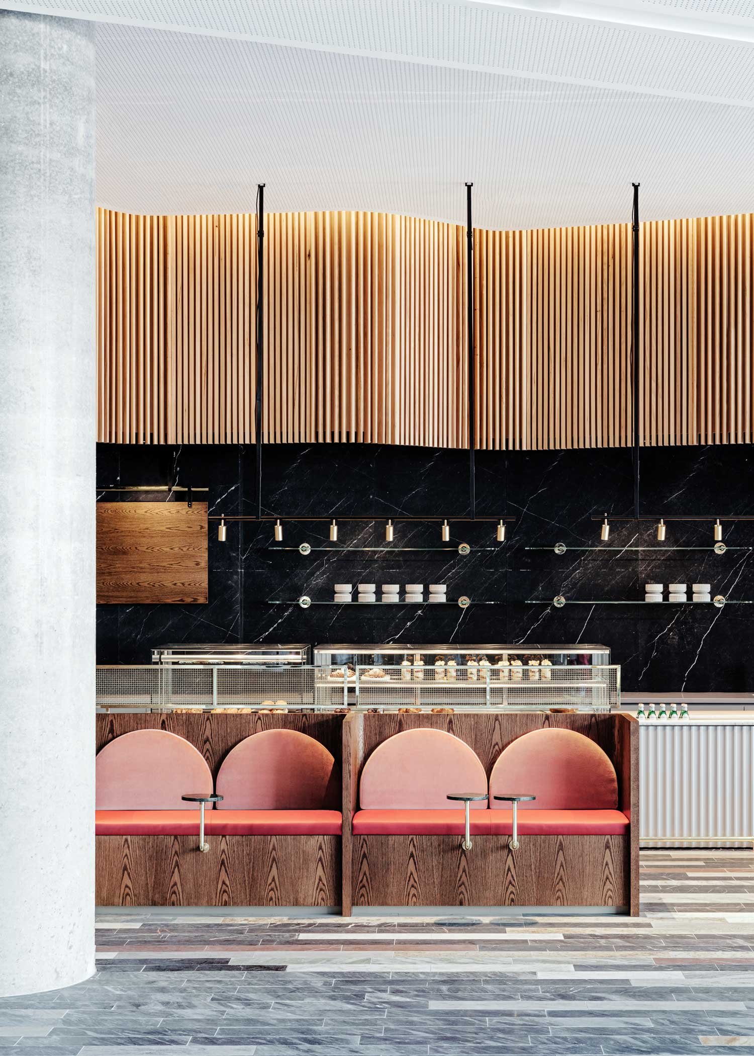
1. Toby’s Estate, designed by Studio Tate
Located in Sydney, Australia, the opulent cafe features varying shades of coral balanced by dark green, black, and white marble. Velvet cushions and dark woods add to the richness of this design, housed on the ground floor of the Commonwealth Bank Building.
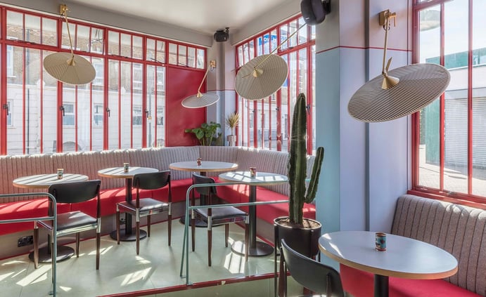
2. Pirana, designed by Sella Concepts
While quaint in size, this London-based restaurant packs quite the punch. The design is playful and adventurous. Retro-inspired details like timber paneled walls, terrazzo flooring, and deep coral woodwork create a truly sensory experience. The coral is offset by hints of pastel mint and light blue, grounded by walnut colored accents and brass details.
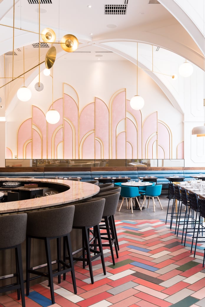
3. Oretta, designed by Commute Design
This isn’t the first time we’ve featured this Toronto restaurant’s design on our blog. (You can check out our interview with Toronto native, Didier Young, here). In this Italian eatery, we’re loving how the designers infused this year’s color of the year into the colorful patterned floors. Art Deco details really define this restaurant, but we can’t help but be drawn to the herringbone floor. Pastel pink, jewel tone blue, forest green, and spectrum of gray mix together to create a stunning feature almost too pretty to walk on.
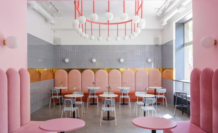
4. Breadway Bakery, designed by Lera Brumina
The Wes Anderson-esque cafe in Odessa, Ukraine, was inspired by the 2014 movie, The Grand Budapest Hotel. Designer Lera Brumina used a palette of corals and cobalt blue to define space within the bakery’s small footprint, separating the takeaway zone, from the dine-in cafe (shown above). From plush velvet banquettes, a tinted grout between glossy gray tiles, and a breathtaking chandelier, the use of coral in this space could not be more impressive.
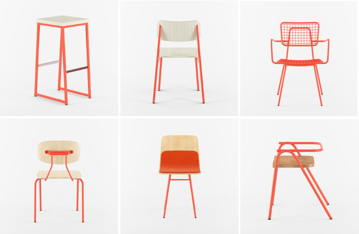
Each year we’re excited to see how Pantone’s color announcement influences restaurant design, and if you’re looking for a way to infuse your space with this year’s color, check out a few of our favorite restaurant chairs in our Salmon Orange color.
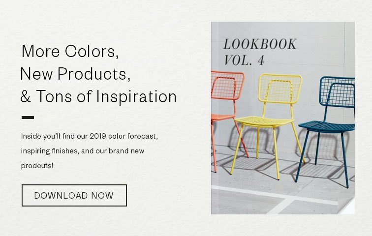
For more inspiration and restaurant trends, download our Look Book.