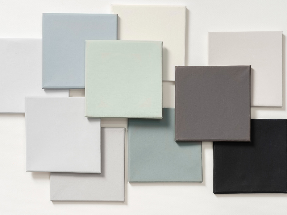
You may or may not have heard, but Dulux, a UK-based paint brand, just released its 2020 Color of the Year. They chose Tranquil Dawn, describing this hue as a “hazy pale green tone” that serves as a visual respite from the “digital and hectic world” we live in.
In honor of this serene green, we rounded up a few installs that incorporate this shade in some way. You’ll find it in the paint, mosaic tiles, accessories, and yes, even the furniture. Get ready for the most soothing scroll yet.
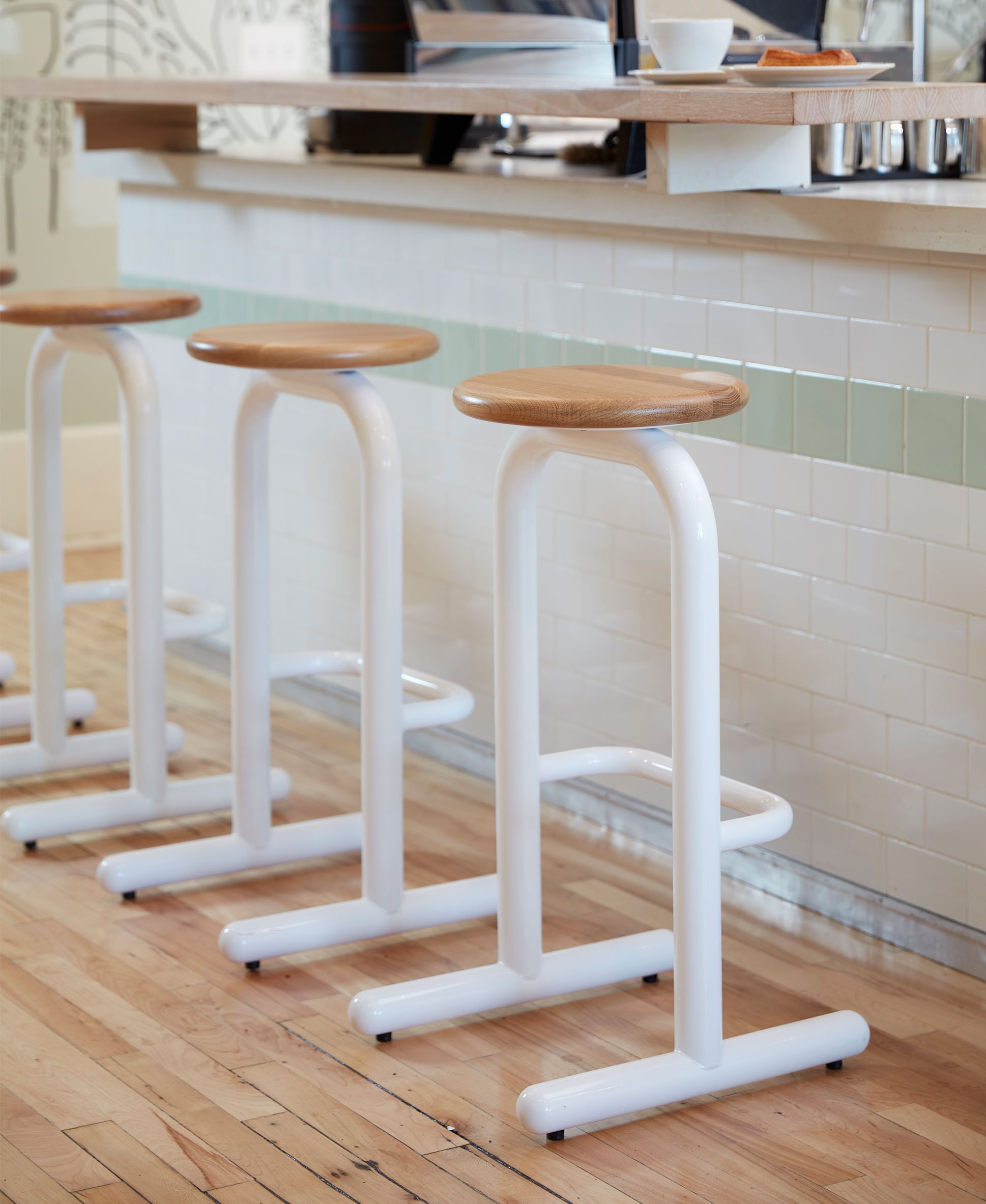
A shade of Tranquil Dawn can be found in the classic subway tiles and back wall of this coffee shop.
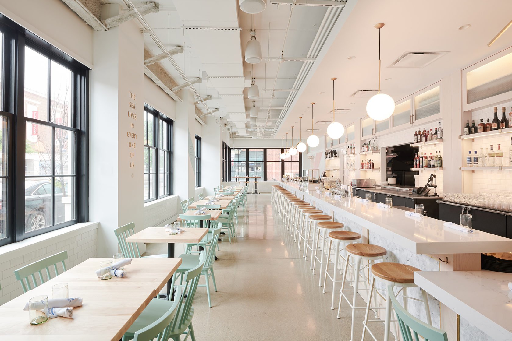
A muted mint can be found on the classic wood chairs in the Chicago seafood restaurant and bar, Two Lights Oyster Co. See more of this design here.
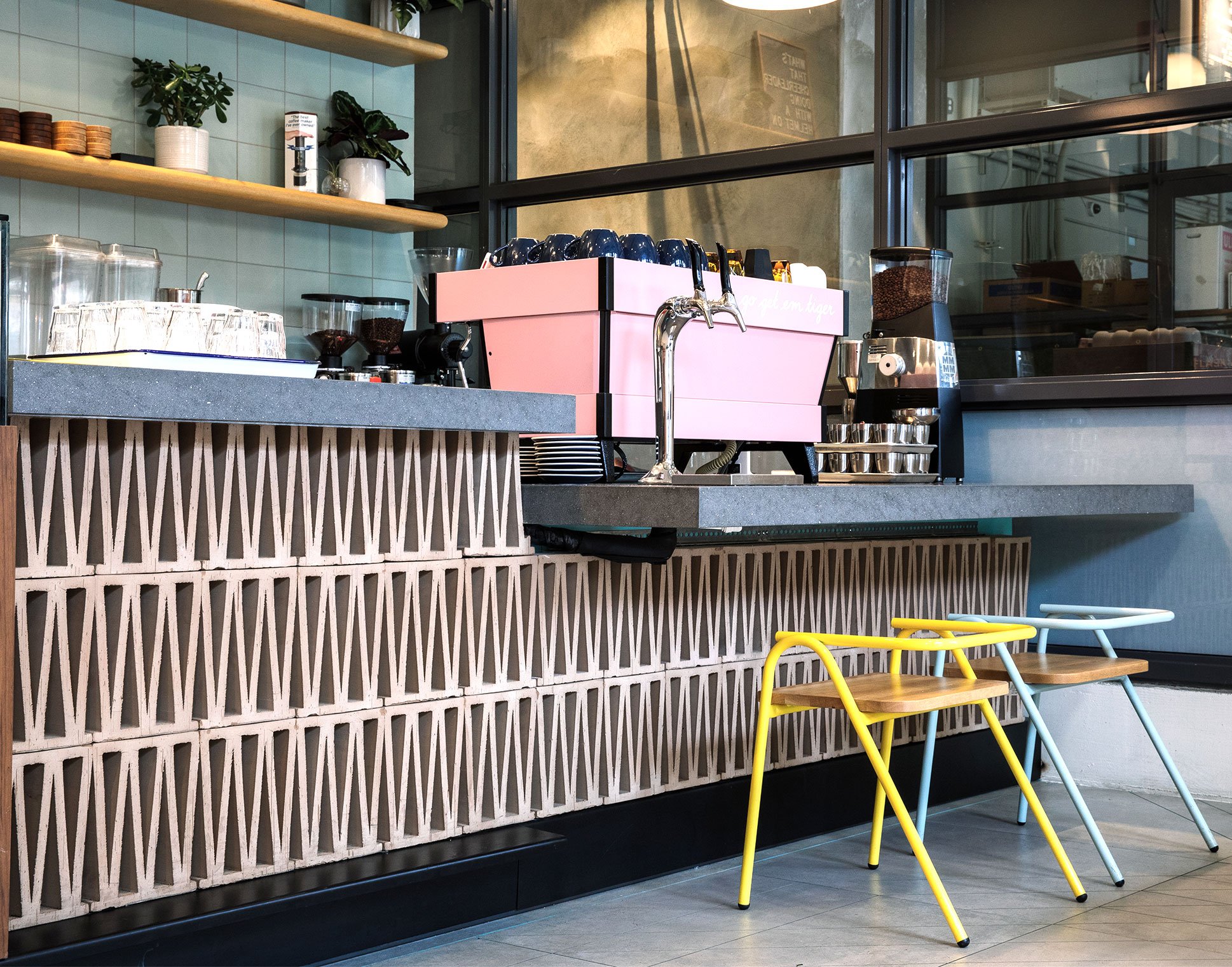
More Tranquil Dawn-esque tiles can be found in the micro coffee chain, Go Get Em Tiger. See the entire space here.
A light and calming corner in the Cleveland café/coworking space Foyer by coworking brand Beauty Shoppe. See the entire design here.
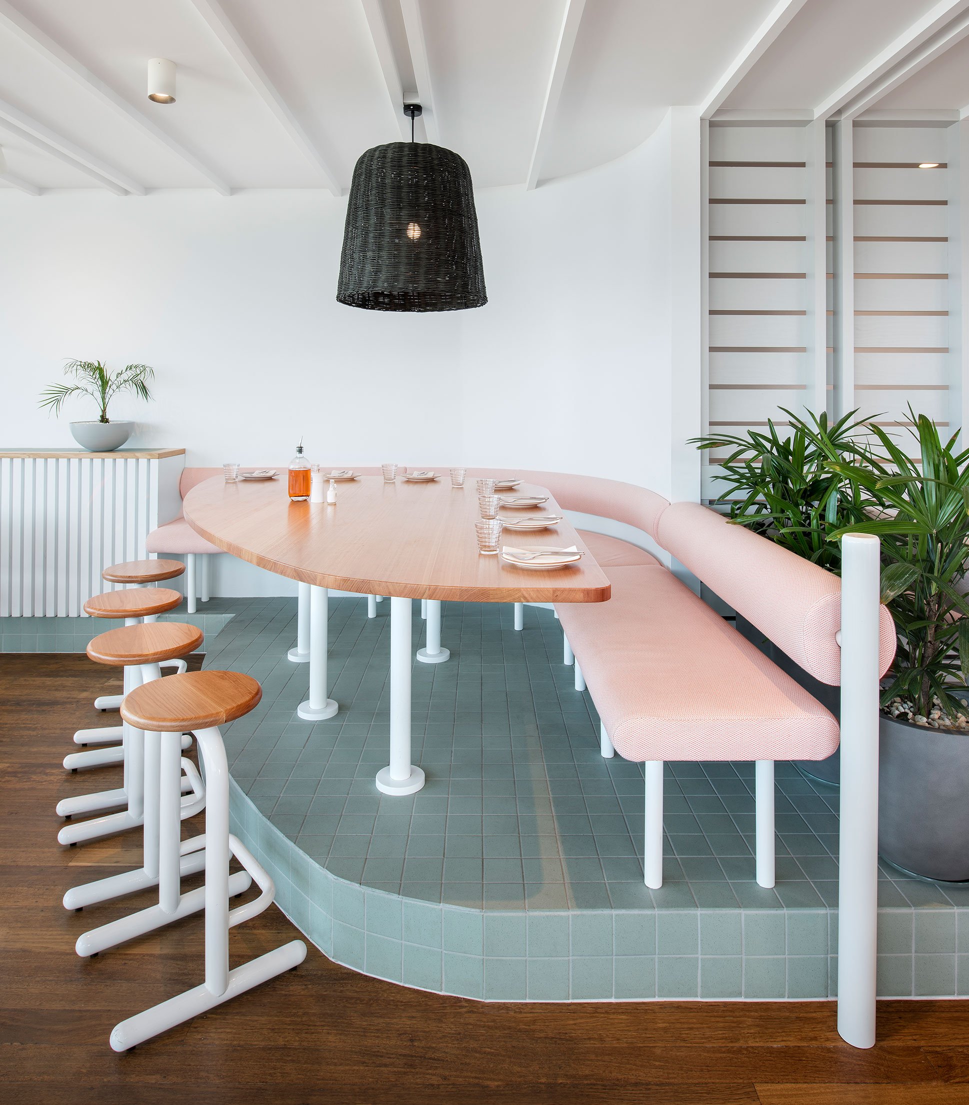
Tranquil Dawn-like tile makes an appearance in the Australia pizzeria, Melt.
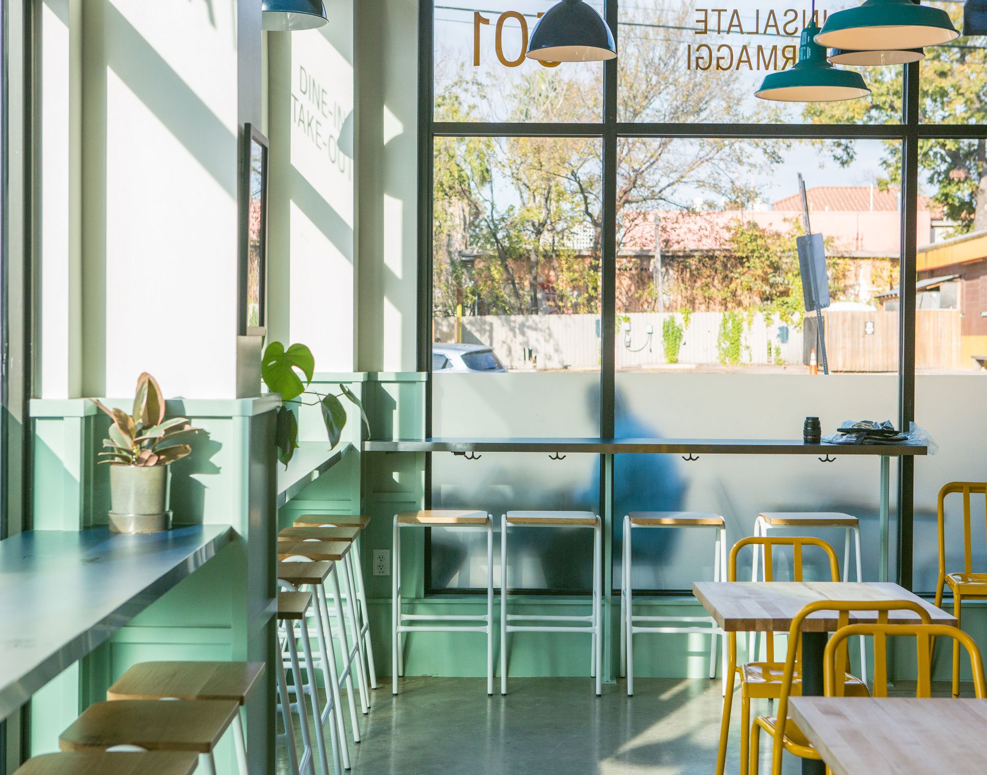 Tranquil Dawn-inspired tones play nicely with pops of yellow and modern furniture in this Austin eatery called La Matta, designed by Clayton & Little.