When planning our 6th Look Book, we reflected on the past year. It was bleak for so many of us—as individuals, as families, as communities, as businesses. It felt like our world had been reduced to grayscale. The Look Book has always been a point of celebration here at Grand Rapids Chair, and we knew this photoshoot had to bring optimism and hope back into the picture. No earth tones or shades of gray, but something energetic, new, and exciting.
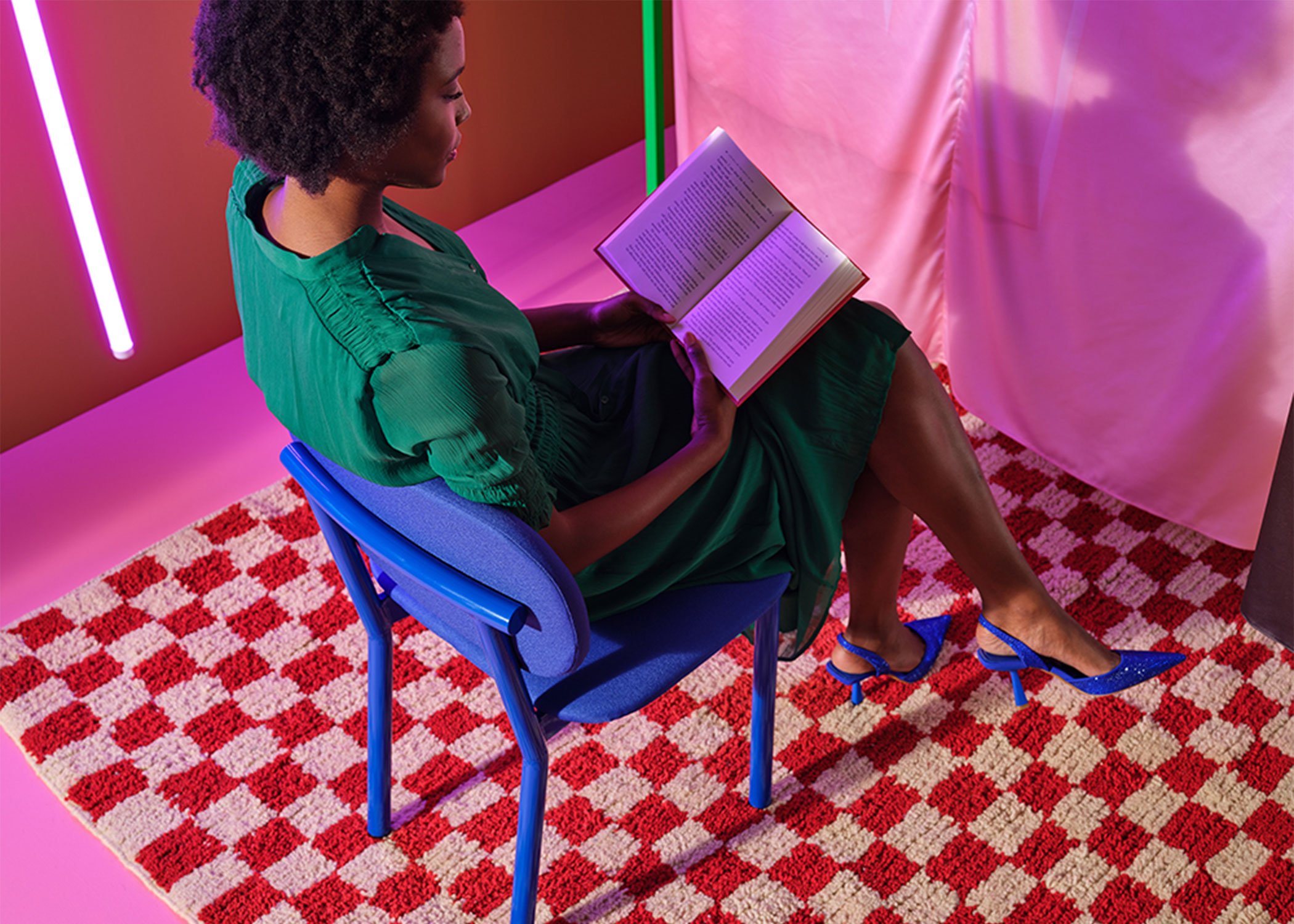
So, we stepped into a space of bold dreams and wild imagination. Nothing was toned down. Every color was at the highest saturation. Every pattern and shape had a contrasting one. Plus, for the first time, we brought in movement. We chose graphic images to print on dynamic silks hanging on steel frames, which rippled at a subtle breeze. Little details move on the webpage like the pensive turn of an ankle, a rolling fruit, a few steps across the image. We even added a moment of stop motion. We tried things we’d never tried before.
This Look Book was a labor of love for the team here at Grand Rapids Chair, from producing these beautiful pieces of furniture to building out the webpages. We hope you enjoy it as much as we have enjoyed producing it.
And now, let’s talk trends and design tips! Here’s a list of five design elements we made use of in this Look Book and their effects on the final images.
Alfred Barstool and Rambo Table
1. Color
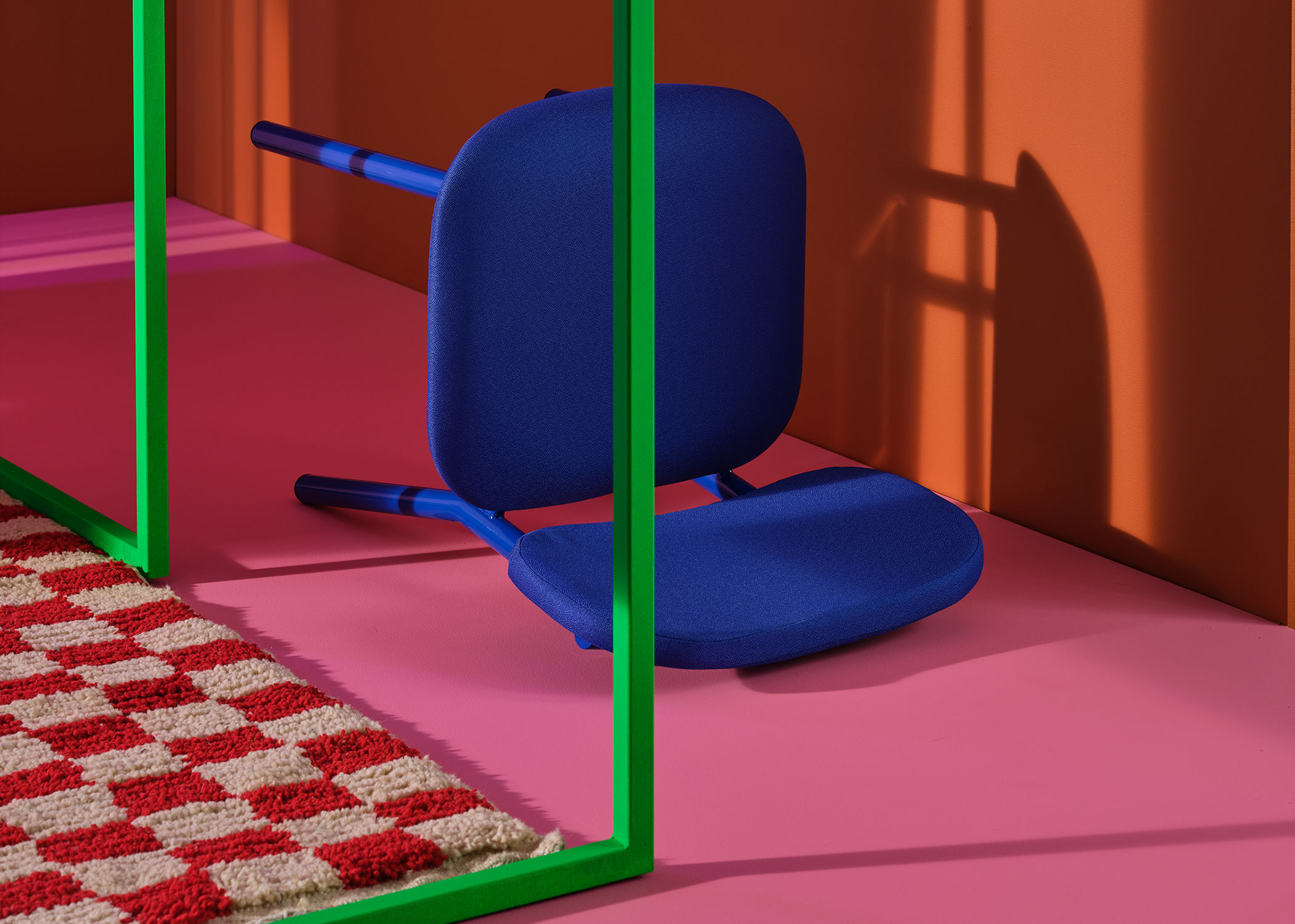
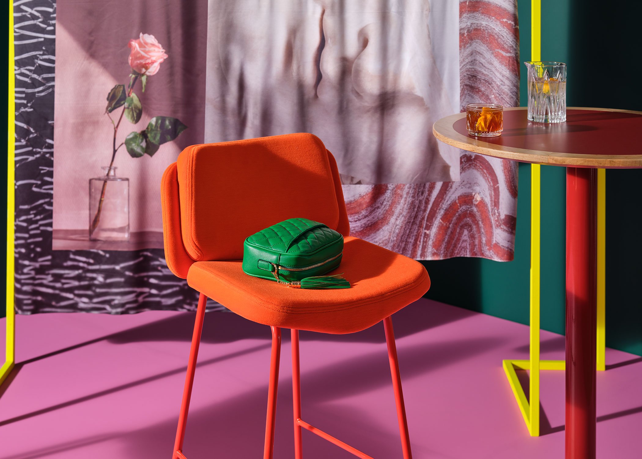
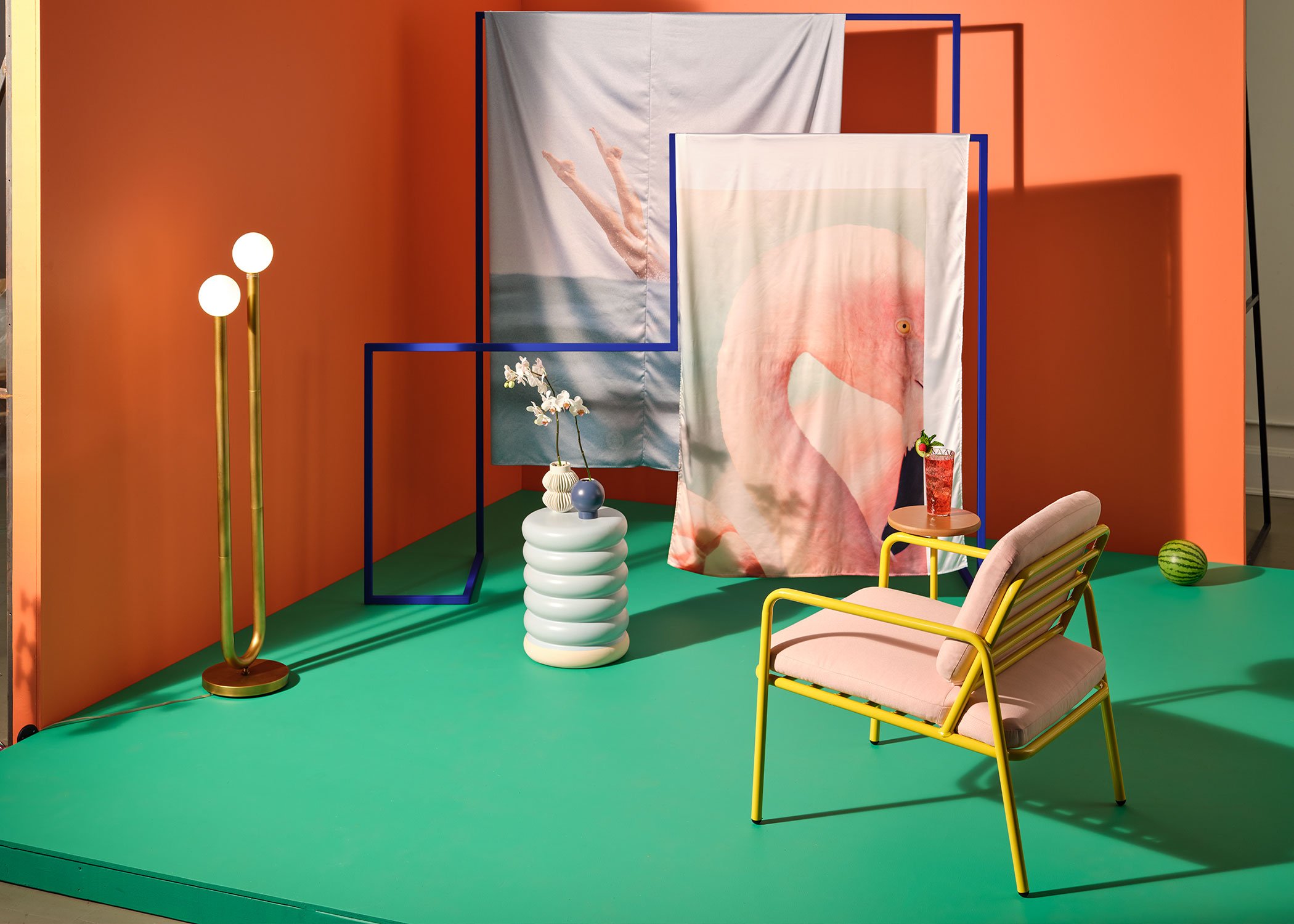
When you look at this Look Book, one of the first things that jumps out is color. The furniture, the sets, the props, and the décor come together to create a palette that is out of this world. Many of our chairs were finished and upholstered to create a monochromatic look. The Alfred Chairs are a fiery red from the cushions to the steel legs. The Sadie II chairs are fully pink. The Ferdinand in royal blue is stunning.
Paired with each of their two-toned backdrops, the colors of the steel frame, the graphics on the silks, and whatever else was brought into the scene, these single-color chairs pop. Blue pops when you set it against red, like a classic 3-D movie. Green looks even more intense against salmon shades. The orange of the Sigsbee chairs' upholstery on a backdrop of lilac is a match made in heaven.
The way these tones and shades pulled together in this high saturation Look Book seemed like a magic trick. I recommend taking notes for your next design project if you feel like getting a little daring with your hues.
2. Contrast
Synthetic and organic, earthy and otherworldly, moss green paired with Barbie pink. Opposites really do attract. As we said in the last section, the way color is used in these sets emphasizes and compliments the furniture while creating a striking scene overall, but color isn’t the only way we employed contrast in these sets. Patterns, materials, and shapes can all create a similar effect.
For example, patterns like checkers, stripes, and grids all have strict man-made shapes and symmetry. Organic, asymmetric patterns like waves, the rings of an agate, or the knots and lines in wood look extra gorgeous and noteworthy when juxtaposed with something like a grid. These kinds of moments of contrast can be found all over these images in the graphics on silks, the materials in the set, and the patterns in rugs and fabrics. The shine of a mirror set beside a panel of wood or something plush next to hard steel makes for a fully engaging sensory experience through visuals alone.
Juxtaposition is a powerful tool when designing. Whether it’s to emphasize or balance elements in a space, contrast can create something exciting and new.
3. Bold lighting
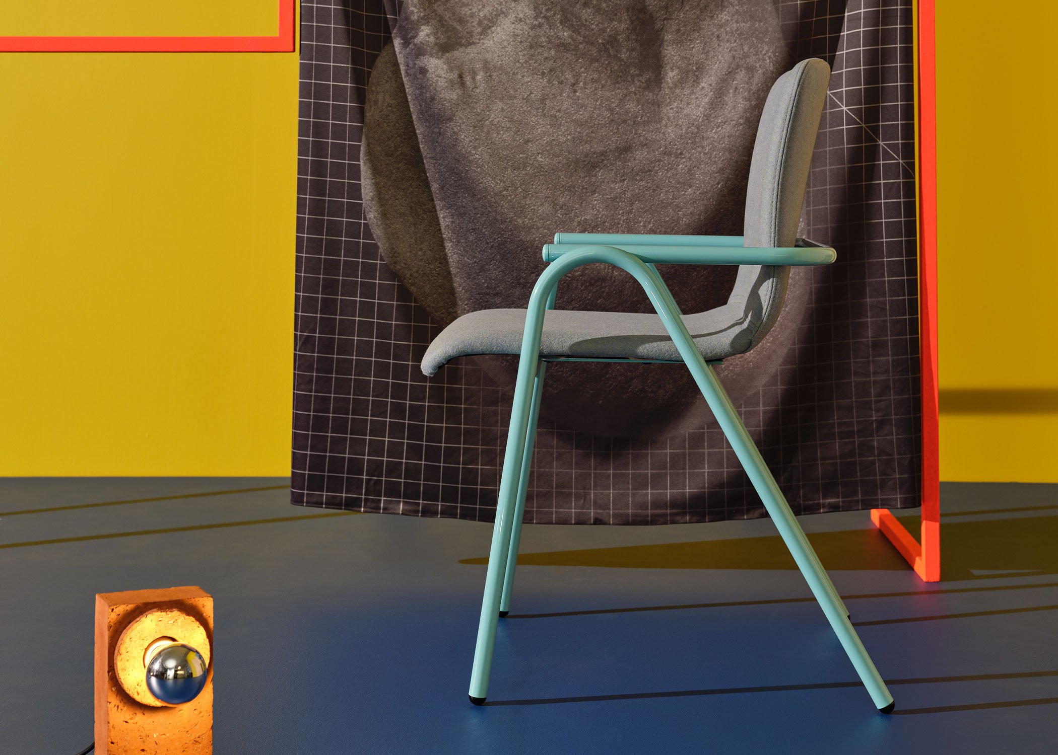
Neon lighting tube was introduced to the United States in the 20s and is just as fashionable today. Casting the solid blue Ferdinand in a pink glow, creating a gorgeous shade of purple, lighting can utterly change a space from institutional to warm to electrifying and back. Choosing the right lighting can be as important as choosing the furniture.
We used a variety of lights in our sets from floor lamps to hanging fixtures. Their aesthetics range from mid century modern to industrial. They were also incorporated into the moments of motion in the Look Book. By shifting the position of a light around the Hula Chair, we created a shadow that moves across the floor as if time is passing quickly. Handcrafted and unique brick lamps blink back and forth in another set. Light takes on a personality in these photos and videos. It can be playful, moody, elegant, and more.
When it comes to using light in design, don’t be afraid to experiment with floor lamps, new hanging fixtures, or even colors!
4. Graphics and Patterns
When it comes to graphics and patterns, these sets are a maximalist dream. Each set pairs printed silks with images, patterns, and designs. Choosing the right graphics for a space can do a lot of work bringing people together and evoking memories, emotions, and thoughts.
For example, in the pictures of Rita with pink upholstery and yellow steel, an image of a diver and a flamingo are set next to one another in the background, suggesting an outdoor feeling without being in an outdoor space. Rita is an outdoor and indoor lounge chair, so while this image is in an indoor setting, there's the suggestion of the outdoors. We evoke the poolside and somewhere warmer with graphics.
Images are beautiful and engaging while also communicating with viewers. Patterns too can communicate messages. You might not use a picnic tablecloth in your award-winning fine dining restaurant, but it would look right at home in your favorite pizza parlor.
Graphics and patterns fit right in with the rising popularity of maximalist designs. Say goodbye to plain white, and hello to stunning wallpapers and murals. But also take a second to reflect on what you want your space to communicate and evoke.
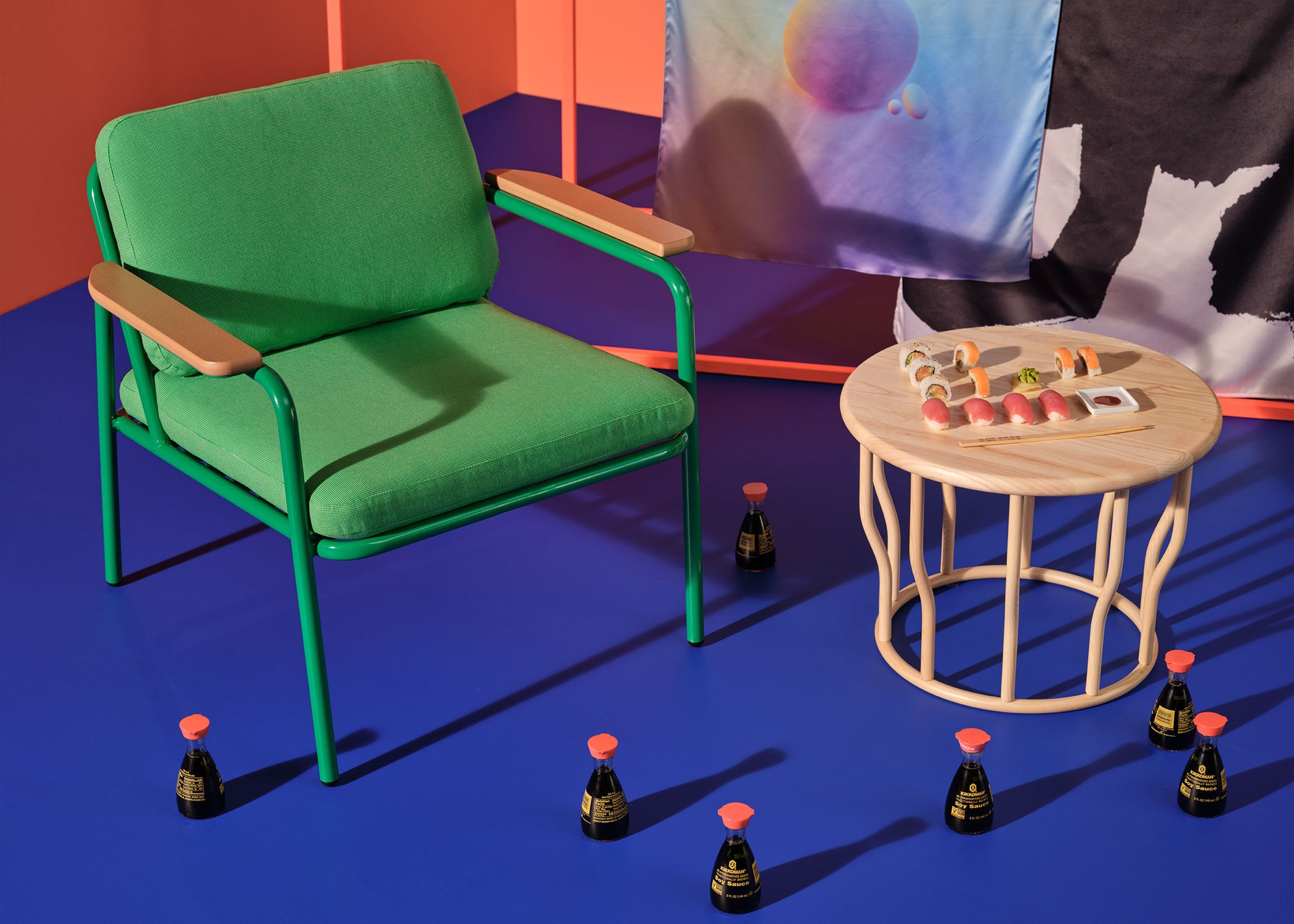
Rita Lounge Chair with Arm Caps and Lewis Coffee Table
5. Comfort
One huge trend we’ve seen since the pandemic is a focus on comfort. So many of us have turned to making our homes as cozy as we can, so now when we go into public spaces, we want more when it comes to feeling comfortable. While comfort has always been a huge part of our mission, we feel it’s become even more essential to create furniture that makes you feel at ease while you’re out and about.
Our latest furniture collection, the Rita Lounge Chair, which is featured prominently in this Look Book, is one of the most comfortable chairs we have ever produced. With cushions that take cues from residential furniture in terms of thickness and give, we’ve brought home comfort into both indoor and outdoor commercial spaces.
Of course, Rita isn’t our only super soft upholstered chair. Alfred, Sigsbee, and Ferdinand are also great dining chairs and barstools with comfortable cushioned seats and backs, and all our other seating was designed with the ideal measurements for you to feel fully supported. We love being design forward without compromising the satisfying feeling of sitting down and getting comfortable.
To download Look Book 6 and see the all of these images and more, click this link. You might also want to check out our blogs on our latest furniture collections: Bowen and Rita.