
Tables with Team Spirit: How Custom Furniture Connects People to Place
The tables we gather around do more than hold drinks and programs. When they’re thoughtfully placed and designed to fit a space, they help shape the experience itself. Learn about the benefits custom furniture has in commercial spaces.
Read More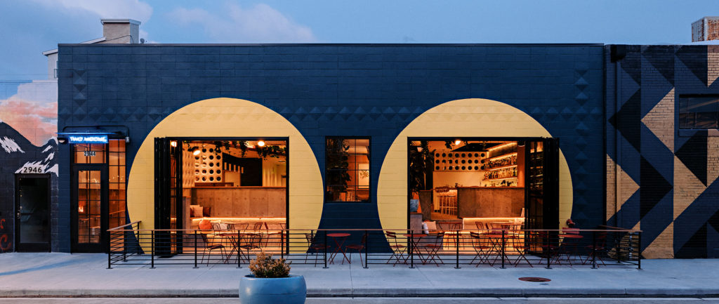
A New Rhythm in RiNo: Designing Two Moons Music Hall
Two Moons is equal parts music venue, cocktail bar, and community hub. And at the heart of its shape-shifting charm is a smart, layered design brought to life by Unum Collaborative.
Read More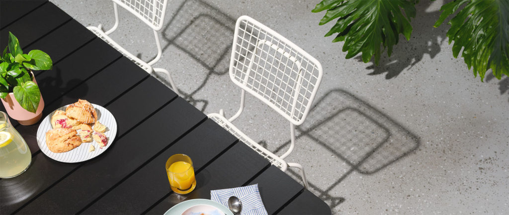
Let’s Take this Outside—Outdoor Spaces that Bring Us Closer
When we talk about designing for connection, look beyond the walls. Thoughtfully designed outdoor spaces can bring us back to ourselves and closer to one another.
Read More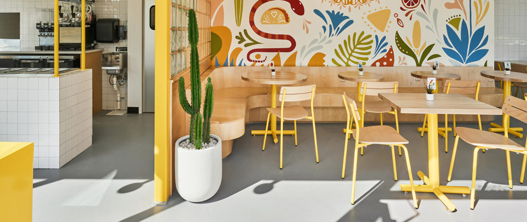
Sunny Side Up: The Joyful Design of Kesos Tacos
For Kim Lewis Designs, color is more than decoration — it is the heartbeat of a space. At Kesos, a taco shack becomes a destination. A meal becomes an experience. And yellow? Yellow becomes joy.
Read More
A Slice of Nostalgia: Inside Muse Pizzeria & Arcade
Muse Pizzeria & Arcade in Colonial Beach, Virginia, blends nostalgic arcade vibes and modern design to create a dynamic, family-focused community hub that celebrates the town’s maritime spirit while offering a unique dining and interactive experience.
Read More
Student Housing Inspired by Lake Life Vibes
Clemson Lofts, designed by Avenir Creative, combines nostalgic lake life themes with modern functionality, creating a student living experience that fosters connection.
Read More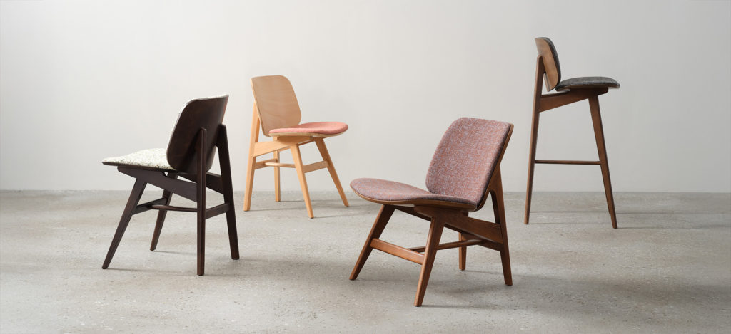
Introducing the Bennett Seating Family — A Balance of Contrasts
Designed by Paul James, Bennett blends bold design, versatility, and comfort with craftsmanship, offering timeless style for any space.
Read More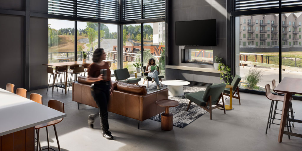
Inspired by Nature — A Community Hub Focused on Adventure
Quarry Trails in Columbus, Ohio, a former limestone quarry turned Metro Park, is now a vibrant community hub designed by Meyers+Associates that connects residents to nature through thoughtfully integrated indoor-outdoor spaces.
Read More
Hospitality-Inspired Design: A New Approach to Wellbeing
Spaces designed for connection have a special magic — they bring people together and make us feel good. Hospitality-inspired spaces excel at this, enhancing how we interact and improving our wellbeing.
Read More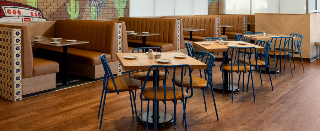
Designing a Fresh Perspective for Nando’s Mexican Café
With the addition of their fifth location in Maricopa, Nando’s Mexican Café was searching for a new image. Partnering with House of Form, the result of the refresh was a vibrant interior that blends Nando’s rich history with a fresh, modern vibe.
Read MoreLoading more posts